
Hiring? Flexiple helps you build your dream team of developers and designers.
- Home
- JavaScript
Rapid Prototyping with Utility-First CSS (Tailwind CSS)
Rapid Prototyping with Utility-First CSS

Hrishikesh Pardeshi
Last updated on
Table of Contents
I am the co-founder of Flexiple and Remote Tools. In this post, I describe why I chose to use a utility-first CSS framework to build my website’s UI in a fast, robust and low-maintenance way.
Product Briefing
We are building an exclusive remote work focussed community, The Remote Clan. The sudden remoteness situation due to COVID-19 works strongly in our favour and hence, we preponed our launch to May 2020.
Over the past 1.5 years, we’ve worked hard to build an audience at Remote Tools and have a solid base of 4000 newsletter subscribers, 20,000 monthly visits, 2 seasons of podcast & 25 stories. The community will be built on top of this and hence, can’t just be a simple MVP.
The exact brief looks like this –
- It’s a community website. Focus has to be on content posts and user profiles.
- UI is critical. No one’s going to be hooked onto the community unless they like the look and feel of the website. Micro interactions are an absolute must.
- Standard forum UIs are a no-no. Need to stand out from traditional forum websites.
- Need the website up and running in < 2 weeks. Build only that’s most essential.
Why Utility-First CSS
1. Rapid prototyping without worrying upfront about abstraction
I figured that utility classes are extremely handy when doing rapid prototyping, especially in the initial stages of app development.
My first priority is always to rapidly build custom UI elements on the page without having to worry about building CSS components from the word go. The latter approach often leads to premature abstraction i.e. building a component for a certain use-case and ending up never using it.
2. Extracting components when I need to
Once I am done adding these utility classes to multiple elements across pages and if I see a common set of utilities used, I can always extract them like this primary button on my website –
.btn-primary {
    @apply font-bold py-2 px-4 border rounded border-azure-radiance-500 hover:border-silver-500 bg-azure-radiance-500 hover:bg-silver-500 transition duration-300 ease-in-out transform hover:-translate-y-1 hover:scale-105;
}
3. Customization to the core
A couple of days into building the website, I realize that the shades of gray across the pages are a little too dark.
I have an entirely new palette for gray and all I have to do is override the gray default in Tailwind.
theme: {
 extend: {
  colors: {
   'gray': {
     100: '#F9F9F9',
     200: '#F0F0F0',
     300: '#E7E7E7',
     400: '#D6D6D6',
     500: '#C4C4C4',
     600: '#B0B0B0',
     700: '#767676',
     800: '#585858',
     900: '#3B3B3B',
    }
   }
 }
}
It’s not just colors. I can practically override or extend any default in Tailwind, be it margins, padding, font, you name it.
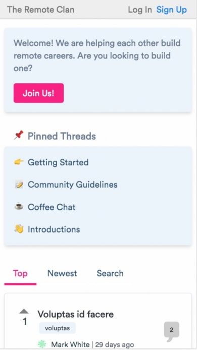
4. Easily responsive
Tailwind provides four breakpoints (sm, md, lg, xl) and I like the fact that the breakpoints are mobile-first by default. So, unprefixed utility classes take effect on all screens while prefixed ones apply only at specified breakpoints and above.
For example, this code is for pages with a right sidebar –
<div class="w-full sm:w-1/4 sm:order-2">
  <div class="sm:mt-16 mt-4">
    <%= render "shared/right_sidebar" %>
  </div>
</div>
<div class="w-full sm:w-3/4 sm:order-1">
..
</div>
So, each of the divs occupy full width on all screens except 640px and above (sm) where the sidebar occupies 25% and the main content takes up the rest.
5. No need to name classes except for extracted components
One thing that always irritates me whenever I look back at the code for Flexiple is the naming of classes. Names like ‘dont-take-our-word_text-content‘ and ‘u-margin-bottom-big‘ should be deemed inventions.
Tailwind’s naming convention is intuitive. More than that, I don’t have to scratch my head to come up with tons of new names.
How’s this different from inline styles?
This is something that bothered me at first. Using inline styles is a taboo and I was worried if I am ending up doing the same here.
But there’s a stark difference between the two. Inline styles allow you to do pretty much anything you want. On the other hand, Tailwind provides you a design system with constraints and all you are doing is choosing styles from that constrained design system.
Atomic classes, no matter how atomic they are, will always remain a finite list.
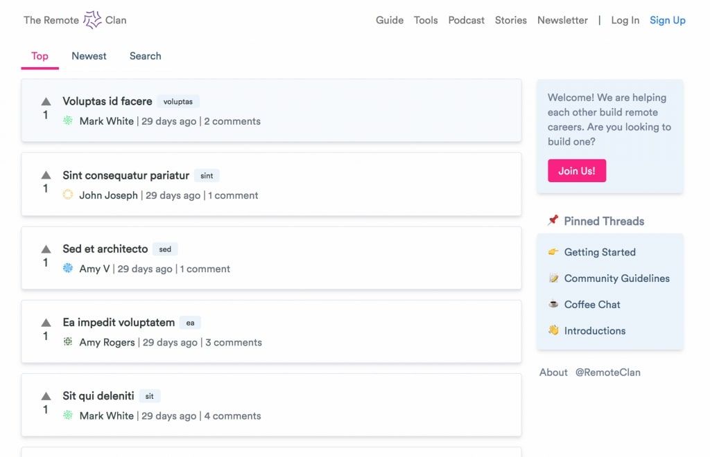
What is The Remote Clan?
We built The Remote Clan, a community for remote workers to build a strong career with the help of those who are pursuing the same goals. Don’t just apply for jobs anymore.
To get early access, share your details here.
.jpg)
.jpg)
.jpg)


.jpg)

