
Hiring? Flexiple helps you build your dream team of developers and designers.
Advanced Flutter Animations – Staggered Animations, Tween Chaining and Transforms

Deven Joshi
Last updated on
Welcome to the second article in our Flutter animation series! In our first article, we touched upon the absolute basics of Flutter animations. In this one, we will delve much deeper, covering implicitly animated widgets, advanced animations and best practices to follow when creating Flutter animations.
As you will see in this article, there are easier ways to create Flutter animations. However, the reason we went with the Ticker + Tween + Controller method in our previous article is that it forms the base of all Flutter animations. Even the most complex animations are just variants and combinations of the same type of animation method.
In a stroke of irony, we will begin advanced Flutter animations with the animations that require the least amount of code.
Let’s get started right away then!
I would highly recommend reading my previous article on the basics of Flutter animations. This article builds heavily on top of it.
Table of Contents
Implicitly Animated Widgets
When we call something ‘implicit’, we mean a quality is inherent in something. In the case of animations, i.e. for implicitly animated widgets, we can effectively say that the code is implicit, meaning it is in-built and does not have to be manually written.
Implicitly Animated Widgets are widgets that automatically animate changes in themselves.
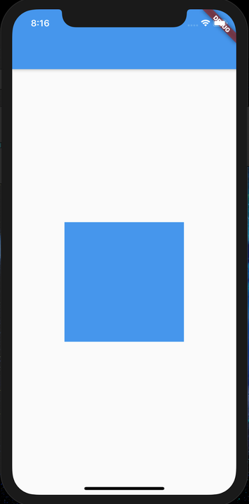
This definition of implicitly animated widgets can sound a bit confusing. So, let’s first start where left off from the last article:
In this example, we used an AnimationController and a Tween to change the size and color of the box.
To increase the size of the box, we set an initial and final size and then used a Tween to grow the box size gradually.
What if we directly changed the box size from, say, 100.0 to 300.0 without any kind of Tween or AnimationController? It would just jump from the initial size to the final size.
Here is where ImplicitlyAnimatedWidgets step in.
If we switch the Container used in the example with an AnimatedContainer, we do not need all of the animation code we discussed earlier. When we change the value of the box from, say, 100.0 to 300.0, it will not jump to the final size directly. Instead, it will gradually change just like it did with our animation code!
Similarly, if color or any other property is changed, it will animate to the final property instead of jumping to the final value. Note that the animation duration is specified by the user.
So, why did we not use this approach earlier?
Because, internally, the class uses the same mechanism for creating a Tween for size or color that we used in the first example.
Let’s now look at the code for this.
First, we simply use a ImplicitlyAnimatedWidget, here AnimatedContainer, and on button click, we change the values we want to. No animation controller, no tween, no animation and yet it animates to the final value!
Let’s quickly create an example similar to one in the first article:
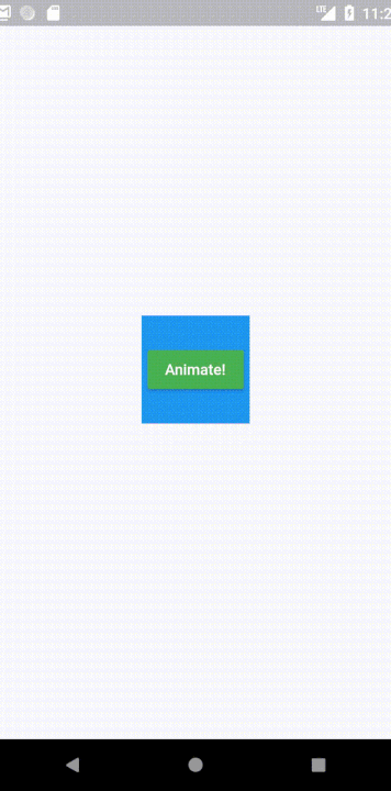
Here, when the button is clicked, the container goes from a smaller initial size and blue in color to a larger size and green in color.
Let’s start with the code:
First, we add an AnimatedContainer and variables to store the current values.
// Simple variables for storing container values
 var color = Colors.blue;
 var height = 100.0;
 var width = 100.0;

 // Inside build()
 AnimatedContainer(
    duration: Duration(seconds: 1),
    color: color,
    height: height,
    width: width,
 ),
Next, on a button click, we change the existing values. Let’s change the values to the screen size:
RaisedButton(
    onPressed: () {
         color = Colors.green;
         height = MediaQuery.of(context).size.height;
         width = MediaQuery.of(context).size.width;
         setState(() {});
   },
   child: Text("Animate!", style: TextStyle(color: Colors.white),),
   color: Colors.green,
),
And that’s it! We have our animation functioning with only so many lines of code!
Staggered Animations
Often, developers need several animations that run one after the other, sometimes on one object, sometimes on several. Such an animation is called a Staggered Animation, meaning there are several steps to the animation.
An example of such an animation can be:
One naïve way to do this is to make several animation controllers and trigger them one after the other. This may work in some cases, however, it makes changing even a small part of the animation a nightmare.
A key element of a Staggered Animation is this – there may be several animations but they need to be connected to a single AnimationController.
Now, simply assigning an AnimationController won’t do justice to our idea as it would start all animations at once and not in steps.
Let’s try creating an example like this:
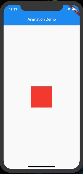
Here, the animation proceeds in two steps, or ‘intervals’, the first is expanding from a small to a larger size and the second is changing color once the first animation completes.
Here, creating two controllers for two animations would lead to a lot of unnecessary code triggering one controller after the other. On the other hand, creating one controller similar to the earlier examples would lead to both animations starting simultaneously.
The solution to this is defining intervals where the animations run. For example, during the progression of the animation controller from 0.0 to 1.0, the first animation runs from 0.0 to 0.5 and the second runs from 0.5 to 1.0.
Let’s put our ideas into code now.
To start with, all we need is to define a simple AnimationController:
AnimationController controller;

// In initState()
controller = AnimationController(vsync: this, duration: Duration(seconds: 3));
We will create a single animation controller for both animations.
We will define animations similar to the previous article, the only difference being adding the interval for each animation.
Animation sizeAnimation;
Animation colorAnimation;

sizeAnimation = Tween(begin: 100.0, end: 300.0).animate(CurvedAnimation(parent: controller, curve: Interval(0.0, 0.5)));
colorAnimation = ColorTween(begin: Colors.red, end: Colors.blue).animate(CurvedAnimation(parent: controller, curve: Interval(0.5, 1.0)));
As you can observe, here, instead of a direct Curve enum object, we pass in an interval. The interval specifies exactly in what duration from 0.0 to 1.0 we want this specific animation to run.
Our size animation will run from 0.0 to 0.5, i.e. half of the animation and post that, the color animation will run.
We can change the interval values to change when the animations run. As a result, we can add as many animations as we want to run serially in a defined interval by simply specifying the same controller and different intervals.
Otherwise, the code remains similar to the earlier example.
// In build()
Center(
 child: Container(
   height: sizeAnimation.value,
   width: sizeAnimation.value,
   color: colorAnimation.value,
 ),
),
We can also create more complex animations like the one below using the same principles:
Staggered animations do well when we need to change several aspects of an object or run several animations in series. However, all animations are run by Tweens which have a simple beginning and end point (For example: begin at 0.0 and end at 100.0).
What if we need the same animation to go from 0.0 to 100.0, then go from 100.0 to 50.0 back to 100.0 and so on?
One way would be to create separate animations for each step and then use a staggered animation to bring them under one AnimationController. This would require several animations for a few steps. How do we solve this?
Tween Chaining
Tween chaining allows us to add multiple tweens to a single animation, hence giving us the power to do several animation steps using just a single animation and AnimationController.
Therefore, we can chain several tweens and also give them weights which allow us to emphasize one animation over the other.
To chain tweens, we need to modify how we create animations.
For example, let’s chain multiple size tweens together:
We chain tweens using the chain() method.
sizeAnimation = Tween(begin: 100.0, end: 0.0)
   .chain(
     TweenSequence(
       [
         TweenSequenceItem(tween: Tween(begin: 0.0, end: 100.0), weight: 1),
         TweenSequenceItem(tween: Tween(begin: 100.0, end: 50.0), weight: 1),
         TweenSequenceItem(tween: Tween(begin: 50.0, end: 75.0), weight: 1),
         TweenSequenceItem(tween: Tween(begin: 75.0, end: 0.0), weight: 1),
       ]
     ),
   )
   .animate(controller);
We use a TweenSequence (self-explanatory: sequence of Tweens) which takes a list of Tweens (here, TweenSequenceItems). Each Tween has a weight, meaning, if there are 4 tweens with weight 1, each takes 1/4th of the time of the animation.
Here, we have used the .chain() method to chain the other Tweens to the first. However, we can get rid of the first Tween and invoke the .animate() method on the TweenSequence instead for better clarity like this:
sizeAnimation = TweenSequence(
 [
   TweenSequenceItem(tween: Tween(begin: 0.0, end: 100.0), weight: 1),
   TweenSequenceItem(tween: Tween(begin: 100.0, end: 50.0), weight: 1),
   TweenSequenceItem(tween: Tween(begin: 50.0, end: 75.0), weight: 1),
   TweenSequenceItem(tween: Tween(begin: 75.0, end: 0.0), weight: 1),
 ],
).animate(controller);
Turning, scaling and translating objects
If your requirement is to animate objects by changing their translation, rotating them etc, then the Transform widget is often used to carry out the animations.
The transform widgets allow us to transform any widget inside it as a child.
We can use transforms with animations to change their rotation, translation or scale as time progresses.
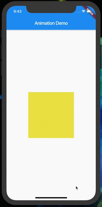
Let’s build an app with a simple spinning colored square like this:
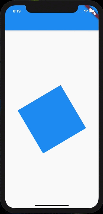
After defining our animation controller, we would need to rotate the square from 0.0 to 3.14 (pi) radians, making it go full circle. Hence, our tween would be:
Animation rotationAnimation;

// Inside initState()
rotationAnimation = Tween(begin: 0.0, end: 3.14).animate(controller);
To build our square,
// Inside build method

Scaffold(
 body: Center(
   child: Container(
     color: Colors.blue,
     width: 200.0,
     height: 200.0,
   ),
 ),
)
Finally, in order to spin the Container around, we will wrap it with a Transform widget.
Center(
 child: Transform.rotate(
   angle: rotationAnimation.value,
   child: Container(
     color: Colors.blue,
     width: 200.0,
     height: 200.0,
   ),
 ),
)
Note that to repeat the animation, we have used controller.repeat() instead of controller.forward().
That’s it! In conclusion, remember that transforms can be used on any type of widget to translate, rotate or scale it.
Having looked at different types of animations, let’s quickly take a look at the best practices in animation.
Best Practices in Animation
Reduce unnecessary rebuilds
When creating Flutter animations, the critical thing to take care of, is to reduce the number of rebuilds of the app (setState() calls).
In our examples, we used this snippet often:
controller.addListener(() {
 setState(() {});
});
Calling setState() invokes the build() method of the widget again. This means the entire layout of the widget is rebuilt, which can lead to inefficiency if we only need to rebuild a small part of the layout.
In this case, it’s better to rebuild only the part of the screen affected by the animation.
For this purpose, we can use the AnimatedBuilder widget which rebuilds a specific part of the layout when an animation progresses.
So, instead of adding the listener to the controller, we can wrap the object that is affected by the animation with AnimatedBuilder():
return AnimatedBuilder(
      animation: _controller,
      builder: (BuildContext context, Widget child) {
        return Container(
         width: animation.value,
         height: animation.value,
         color: Colors.blue,
        );
      },
    );
Do not try to build the entire build() method using AnimatedBuilder as there is no point building the entire tree if it is unaffected by the animation. Only wrap the subtree affected by the animation so that the animation runs smoothly and no resources are wasted.
Dispose unused resources
AnimationControllers should be disposed when done, to reduce memory usage. Every widget offers a dispose() method to dispose resources when the widget is destroyed.
@override
void dispose() {
 super.dispose();
 controller.dispose();
}
Similarly, many other controller objects often need disposing too.
To check if the widget is still in the tree, when needed to dispose or to use, the mounted property comes handy. You can do the following:
if (mounted) {  // Any controller method call
  controller.methodCall();
}
Till this point, we have seen examples of simple animated blocks. To put things into perspective, it is best if we can pick a real-world example and build that animation(s) from scratch.
This is exactly what we will be doing in the next section!
Coding a real-world Flutter animation
Since we have covered most fundamentals of Flutter animations, we can now try building a full fledged animation. Let’s try building something like this:
Our example in this article revolves around the design for a To-do list app.
From top to bottom, it contains:
- AppBar (Containing profile picture button)
- Greeting message
- Task List
- Floating Action Button
Each part has one animation linked to it which runs one after the other.
First, we’ll build the page, then we will focus on animating it.
-kxryv.png)
Building the layout
1) AppBar
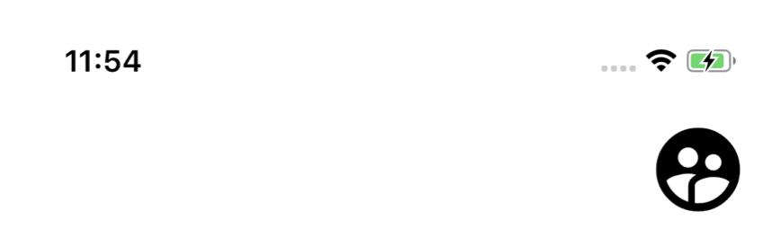
Our AppBar only has a profile picture and nothing else. We can use an Icon as a placeholder here.
Note that, by default, AppBars have an elevation we need to get rid of, to get a flat design.
We can add the IconButton to the AppBar actions parameter for adding the clickable accounts icon. The actions parameter allows to add actions like a menu to the AppBar.
The final code comes to:
AppBar(
 brightness: Brightness.light,
 backgroundColor: Colors.white,
 actions: <Widget>[
   IconButton(
     icon: Icon(Icons.supervised_user_circle),
     color: Colors.black,
     onPressed: () {},
     iconSize: 60.0,
   ),
 ],
 elevation: 0.0,
)
If you noticed, we have also set the brightness parameter. The problem with a completely white background is that system icons like phone battery, wifi signal, etc become invisible if they are also white.
Setting the brightness parameter instructs the OS to tackle this scenario and hence, we can avoid a scenario where all system or notification icons are invisible.
We will use this parameter, for example, if we need to display dark icons over a white background instead of the default white icons, which would simply not be visible.
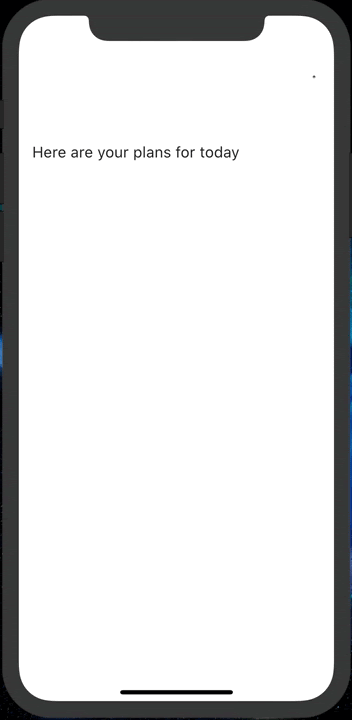
2) Greeting Message
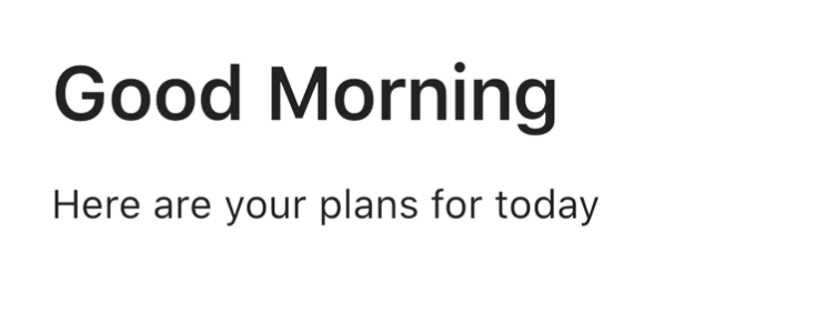
This is a simple Column consisting of two Text widgets. We can use SizedBox here for spacing, however, Padding works just as well.
Column(
   crossAxisAlignment: CrossAxisAlignment.start,
   children: <Widget>[
     SizedBox(
       height: 16.0,
     ),
     Text(
       "Good Morning",
       style: TextStyle(fontSize: 34.0, fontWeight: FontWeight.w600),
     ),
     SizedBox(
       height: 18.0,
     ),
     Text(
       "Here are your plans for today",
       style: TextStyle(fontSize: 18.0),
     ),
   ],
 ),
)
3) Task List
-0bvwc.png)
This is one of the easiest things to do as Lists are far easier to set up than in platforms like Android which require adapters and context switching. For a more in-depth List comparison, check out this link.
Here, we create an infinite List with the ListView.builder constructor.
ListView.builder(
 itemBuilder: (context, position) {
   return CheckboxListTile(
     title: Text("This is item $position"),
     value: true,
     onChanged: (val) {},
   );
 },
)
Instead of creating our own items, we’ll use the in-built CheckboxListItem widget to do the hard work for us.
4) Floating Action Button (FAB)
This is a trivial element to add.
FloatingActionButton(
 onPressed: () {},
 child: Icon(Icons.add),
)
Adding Animations
The most crucial part of adding animations is deciding what we want to animate. For example, do we want something to fade in or grow? Fly in or rotate?
In our example, the profile picture icon, text and FAB grow to their size while the list fades in.
This is all done in a sequential manner, so, we need to use staggered animations.
First, as always, we will define our controller. After that, we will define the animations.
- For defining growth animations, we can define Tweens that go from 0 to their normal size, or, 0 to 1.0 and multiply that number with the defined size (Tween value is a multiple of the size).
- For defining the fade-in animation, we can use the Opacity widget around the ListView.
Note: If you want to fade in between two widgets, try CrossFade instead.
One additional thing we need to do in order to add sequence is to add Intervals to the definition of the animation.
Let’s define four animations for each of the things we described above.
AnimationController _controller;

Animation _profilePictureAnimation;
Animation _contentAnimation;
Animation _listAnimation;
Animation _fabAnimation;

@override
void initState() {
 super.initState();

// iconSize goes from 0.0 to 50.0
 _controller =
     AnimationController(vsync: this, duration: Duration(seconds: 4));
 _profilePictureAnimation = Tween(begin: 0.0, end: 50.0).animate(
     CurvedAnimation(
         parent: _controller,
         curve: Interval(0.0, 0.20, curve: Curves.easeOut)));

// fontSize goes from 0.0 to 34.0
 _contentAnimation = Tween(begin: 0.0, end: 34.0).animate(CurvedAnimation(
     parent: _controller,
     curve: Interval(0.20, 0.40, curve: Curves.easeOut)));

// Opacity goes from 0.0 to 1.0
 _listAnimation = Tween(begin: 0.0, end: 1.0).animate(CurvedAnimation(
     parent: _controller,
     curve: Interval(0.40, 0.75, curve: Curves.easeOut)));

// Fab Size goes from size * 0.0 to size * 1.0
 _fabAnimation = Tween(begin: 0.0, end: 1.0).animate(CurvedAnimation(
     parent: _controller,
     curve: Interval(0.75, 1.0, curve: Curves.easeOut)));
 _controller.forward();
 _controller.addListener(() {
   setState(() {});
 });
}
Now, we need to modify the widgets to take the animation values.
The widgets then become:
1) Profile Picture Icon
IconButton(
 icon: Icon(Icons.supervised_user_circle),
 color: Colors.black,
 onPressed: () {},
 iconSize: _profilePictureAnimation.value,
),
2) Content
Column(
 crossAxisAlignment: CrossAxisAlignment.start,
 children: <Widget>[
   SizedBox(
     height: 16.0,
   ),
   Text(
     "Good Morning",
     style: TextStyle(fontSize: _contentAnimation.value, fontWeight: FontWeight.w600),
   ),
   SizedBox(
     height: 18.0,
   ),
   Text(
     "Here are your plans for today",
     style: TextStyle(fontSize: 18.0),
   ),
 ],
)
3) ListView
Opacity(
 opacity: _listAnimation.value,
 child: ListView.builder(
   itemBuilder: (context, position) {
     return CheckboxListTile(
       title: Text("This is item $position"),
       value: true,
       onChanged: (val) {},
     );
   },
 )
Note: Here, the opacity widget controls the visibility of its child widget
4) Floating Action Button
Transform.scale(
 scale: _fabAnimation.value,
 child: FloatingActionButton(
   onPressed: () {},
   child: Icon(Icons.add),
 ),
)
And this gives us our final animation!
Here is the complete code for the app:
import 'package:flutter/material.dart';

void main() => runApp(MyApp());

class MyApp extends StatelessWidget {
 // This widget is the root of your application.
 @override
 Widget build(BuildContext context) {
   return MaterialApp(
     title: 'Flutter Demo',
     theme: ThemeData(
       primarySwatch: Colors.blue,
     ),
     home: MyHomePage(),
     debugShowCheckedModeBanner: false,
   );
 }
}

class MyHomePage extends StatefulWidget {
 @override
 _MyHomePageState createState() => _MyHomePageState();
}

class _MyHomePageState extends State<MyHomePage>
   with SingleTickerProviderStateMixin {
 AnimationController _controller;

 Animation _profilePictureAnimation;
 Animation _contentAnimation;
 Animation _listAnimation;
 Animation _fabAnimation;

 @override
 void initState() {
   super.initState();
   _controller =
       AnimationController(vsync: this, duration: Duration(seconds: 4));
   _profilePictureAnimation = Tween(begin: 0.0, end: 50.0).animate(
       CurvedAnimation(
           parent: _controller,
           curve: Interval(0.0, 0.20, curve: Curves.easeOut)));
   _contentAnimation = Tween(begin: 0.0, end: 34.0).animate(CurvedAnimation(
       parent: _controller,
       curve: Interval(0.20, 0.40, curve: Curves.easeOut)));
   _listAnimation = Tween(begin: 0.0, end: 1.0).animate(CurvedAnimation(
       parent: _controller,
       curve: Interval(0.40, 0.75, curve: Curves.easeOut)));
   _fabAnimation = Tween(begin: 0.0, end: 1.0).animate(CurvedAnimation(
       parent: _controller,
       curve: Interval(0.75, 1.0, curve: Curves.easeOut)));
   _controller.forward();
   _controller.addListener(() {
     setState(() {});
   });
 }

 @override
 Widget build(BuildContext context) {
   return Scaffold(
     backgroundColor: Colors.white,
     appBar: _buildAppBar(),
     body: _buildBody(),
     floatingActionButton: _buildFAB(),
   );
 }

 Widget _buildAppBar() {
   return AppBar(
     brightness: Brightness.light,
     backgroundColor: Colors.white,
     actions: <Widget>[
       IconButton(
         icon: Icon(Icons.supervised_user_circle),
         color: Colors.black,
         onPressed: () {},
         iconSize: _profilePictureAnimation.value,
       ),
     ],
     elevation: 0.0,
   );
 }

 Widget _buildBody() {
   return Column(
     crossAxisAlignment: CrossAxisAlignment.start,
     children: <Widget>[
       Expanded(
         child: Container(
           padding: EdgeInsets.all(16.0),
           child: Column(
             crossAxisAlignment: CrossAxisAlignment.start,
             children: <Widget>[
               SizedBox(
                 height: 16.0,
               ),
               Text(
                 "Good Morning",
                 style: TextStyle(fontSize: _contentAnimation.value, fontWeight: FontWeight.w600),
               ),
               SizedBox(
                 height: 18.0,
               ),
               Text(
                 "Here are your plans for today",
                 style: TextStyle(fontSize: 18.0),
               ),
             ],
           ),
         ),
       ),
       Expanded(
         flex: 3,
         child: Opacity(
           opacity: _listAnimation.value,
           child: ListView.builder(
             itemBuilder: (context, position) {
               return CheckboxListTile(
                 title: Text("This is item $position"),
                 value: true,
                 onChanged: (val) {},
               );
             },
           ),
         ),
       ),
     ],
   );
 }

 Widget _buildFAB() {
   return Transform.scale(
     scale: _fabAnimation.value,
     child: FloatingActionButton(
       onPressed: () {},
       child: Icon(Icons.add),
     ),
   );
 }
}
Next Steps
One of the best parts about Flutter animations is that even the most complex animations use the same fundamental principles and techniques that simple animations use.
To see more animated widgets, check out this link on flutter.dev.

